he Valle d’Aosta Autonomous Region announces a competition of ideas for the design of the Balteus logo, for a new tourist product developed within the strategic project “Bassa Via della Valle d’Aosta” co-financed by the European Fund. The “Bassa Via” is aimed at the sustainable development of medium and low altitude locations (currently marginally affected by the flows tourism), in a logic of delocalisation and seasonal adjustment of flows. The Cammino Balteo, is, in fact, a tourist product designed primarily for the spring and autumn.
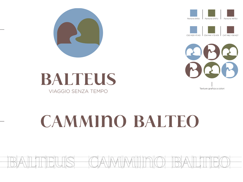
Our Balteus Logo proposal is inspired by the key concepts well expressed in the Brief.
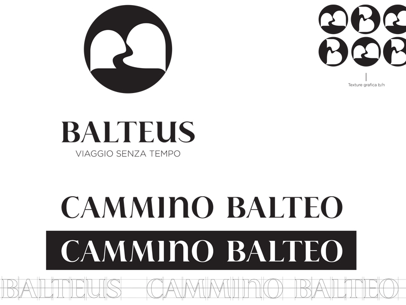
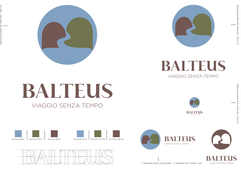
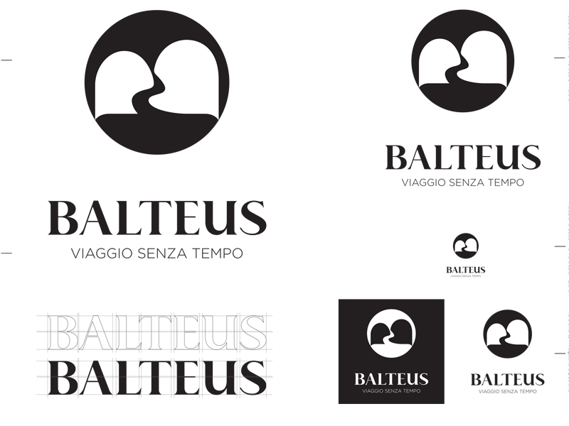
The sign is born from a graphic elaboration of the initial capital of the naming “B”. Rotated horizontally it brings us back to the reading of a different, soft sign that recalls the geometires of the mountain relief ge. At the base, between them flows a passage, a journey, a stream. The circle around gives more strength to the sign and communicates a concept of a basin, a path that unites and surrounds. The colors have been selected by studying carefully the color trends of 2020, but above all shades have been selected slightly desaturated to give elegance and nobility to the brand itself.
The lettering, specially designed for the Balteus brand, is a serif font, with a definite however harmonious contrast and stylistic choices that make it more contemporary and extremely strong, recognizable and original.